Have you ever opened your own website on your phone and thought, “Wait… why does it look like that?”
The heading wraps in a strange place. A photo cuts off something important. The menu takes up half the screen, or the button you need is harder to find than it should be.
You know how you wanted it to feel. But that isn’t quite what you’re seeing.
That’s why Apple’s newly announced iPhone Duo is worth a conversation beyond the phone itself. Announced September 9, it folds open to a larger display, giving people another way to browse. Apple says availability begins October 23, 2026.
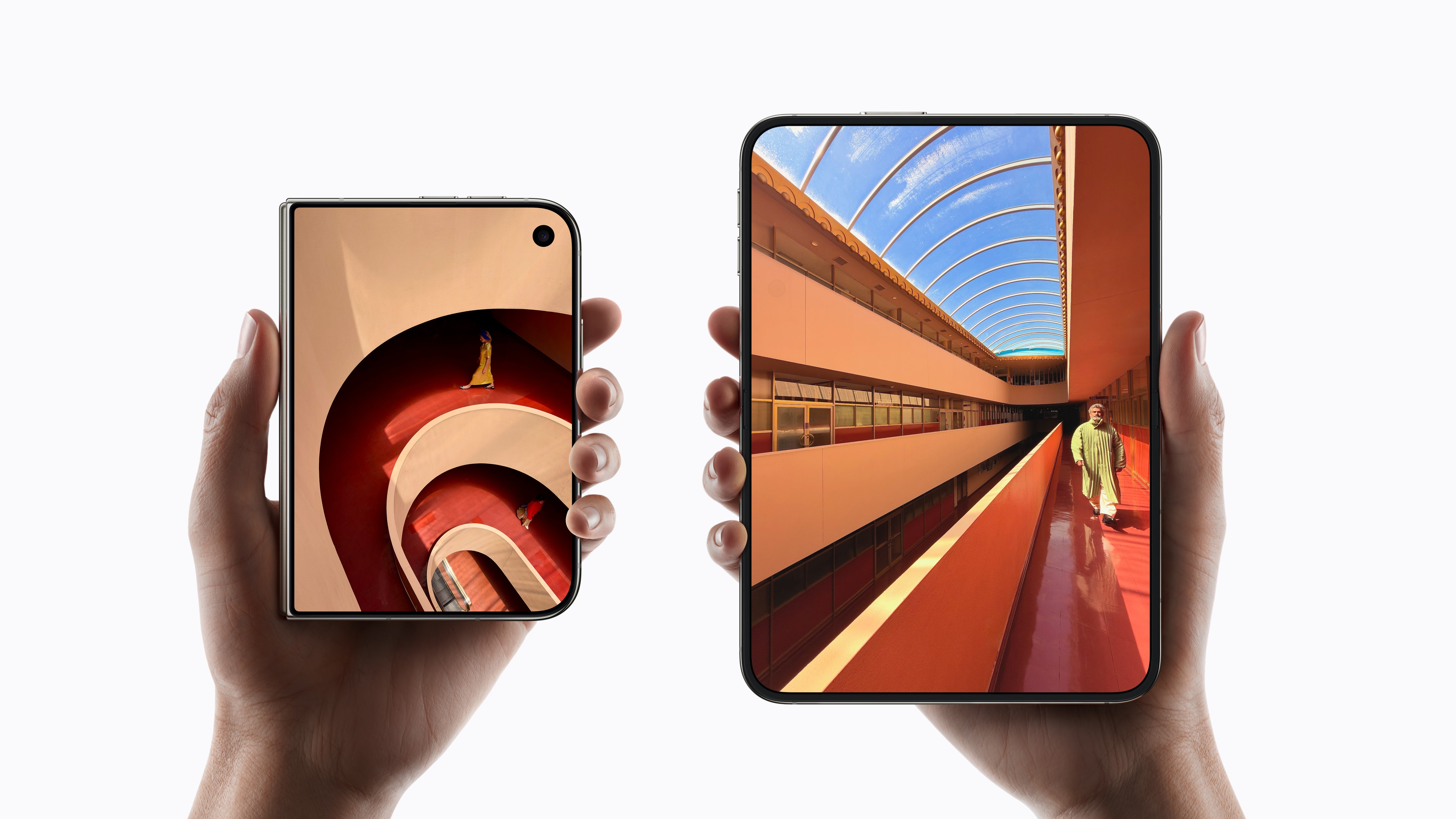
For business owners, the interesting part is what that means for the person opening your website.
Your customers don’t stay at one screen
I move between my phone, laptop, and desktop, especially when I’m traveling. It’s a good reminder that the way I see something at my desk isn’t the only way someone else will experience it.
Think about how a customer might find you. A friend sends them your link. They look up your hours from their phone. They compare a few services on a laptop and come back later to ask a question.
Your website needs to make sense in each of those moments.
That’s what responsive design is meant to do: let the layout adjust as the space changes. Photos resize, columns move, and menus adapt, while the information people need stays within reach.
It doesn’t have to look identical everywhere. It should feel like the same business—and be comfortable to use.
Phones matter. So do the people using everything else.
There’s a reason the mobile experience deserves attention. Pew Research Center’s 2025 survey found that 97% of US adults ages 18–29 owned a smartphone. That’s ownership, rather than a measure of how they browse, but it helps explain why phones belong in this conversation.
Desktop hasn’t disappeared, either. In August 2026, phones accounted for about 42% of the US page views measured by Statcounter, compared with about 56% for desktop. Your own audience may look different. See the US figures.
My takeaway isn’t that you need to choose one screen over another. It’s that someone should be able to reach you comfortably from the device they have in front of them.
You don’t need to know all the technical terms
You’re running a business. You shouldn’t have to know every screen size or follow every phone announcement to ask for a website that works well.
You can ask questions like these:
- “Can you show me how this works on a phone?” Go beyond the homepage. Open the menu, read a service page, and find the next step.
- “What happens when the screen changes?” Turn a phone sideways or make a browser window narrower. Can you still read everything and use the controls?
- “Can we walk through the contact form?” Arrange a test with your developer. Check what happens when a field is missed, whether the form sends, and how someone knows their message went through.
- “How does it feel on an older phone or a slower connection?” A beautiful image shouldn’t leave someone waiting to find your phone number.
- “What if someone needs larger text or uses a keyboard?” Reading and moving around the site should still be manageable.
- “Who checks this after launch?” New content, software updates, and changing browsers can all give you reasons to review the experience again.
Those are useful questions. You don’t need to arrive with the answers—that’s part of what your website professional should help you work through.
Make room for your content, too
Sometimes the answer is better spacing. Sometimes it’s a shorter paragraph, a different image crop, or moving an important link somewhere more helpful.
But making a page easier to read on a phone shouldn’t mean losing the information someone needs to understand your services.
There’s a search reason for that, too. Google uses mobile content for indexing and ranking and recommends responsive design. It’s one part of a sound search foundation, not a guarantee of a particular ranking.
Clear headings and shorter sections can give your content room to breathe without stripping out what makes your business worth knowing.
A new phone doesn’t mean you need to start over
I don’t want every technology announcement to feel like another thing on your business to-do list.
The iPhone Duo is a reminder to look at your website with fresh eyes, not a reason to assume everything needs replacing. Start with what your customers need to do. If something feels awkward, take a screenshot or make a note. That gives us somewhere useful to begin.
For your business here in Omaha or elsewhere in Eastern Nebraska, the goal is the same: help people understand what you do and make it easy to take the next step.
That’s the care I want to bring to your website’s design and development. The layout, the words, the little details—they should work together for the people on the other side of the screen.
Send me your website and tell me what feels off. You don’t need a technical explanation to start the conversation.
Source note: Figures were checked September 14, 2026. Pew’s figure describes US smartphone ownership, not website traffic. Statcounter’s percentages are rounded from 42.21% mobile and 55.65% desktop and cover page views on participating US websites—not every website or Nebraska specifically. Its data can be revised for 45 days. Methodology.