Most small businesses are using AI for something now. The U.S. Chamber of Commerce's research on small business technology puts regular use around 68%. The number I find more telling is the other one: roughly 77% of those businesses have no written policy at all governing how it's used. No rule about what gets pasted into it, no one reviewing what comes back out, nobody specifically responsible when it goes sideways. It's one person trying a tool on their own, seeing what happens, and moving on.
That's fine when the something is a social media caption. It gets considerably riskier when the something is your website.
I want to walk through an example rather than give you a list of warnings, because the specifics are the whole point. Picture a small-town nonprofit — call it the Fairview Community Center. Same website for years, built on one of those all-in-one site builders. Someone on the board is comfortable with computers, and decides to modernize a page. They describe what they want to an AI tool, it produces a large block of code, they paste that into the site's custom HTML box, and it looks good. On their laptop. At first glance.
Everything below is what tends to happen next. None of it looks like "broken" to the person who built it.
The empty boxes
This is the one you can spot without knowing anything about code, and it's the clearest tell that something was never finished.
AI-generated layouts lean heavily on small icons — a little symbol above each card, a marker beside a button. When the tool doesn't have real icon files to work with, it reaches for characters it can type instead. Some of those are emoji and render fine. Others are characters that look like icons in a code editor and render as a plain outlined square in a browser.
On one page I looked at recently, eight of these symbols were used as icons. Three of them came out as empty squares — including one sitting directly inside a button, so the button reads as a blank box followed by the words. The other five were emoji, in two different visual styles, because the tool used a plain-text arrow in one spot and the emoji version of the same arrow a few inches below it.
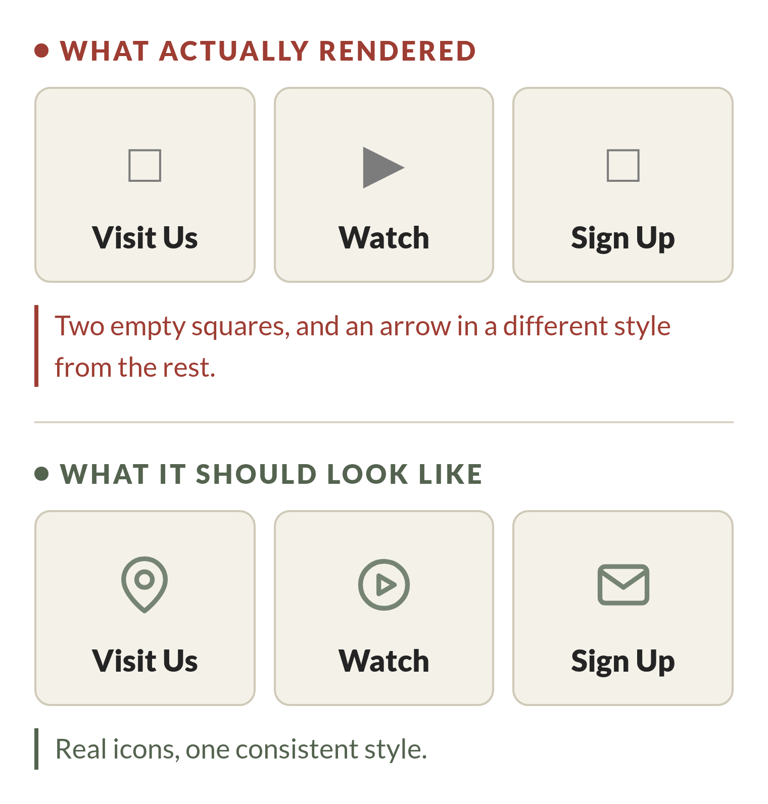
Here's what makes this a design problem rather than a typo: a person with a design background sees eight icons in three inconsistent styles and immediately reads it as unfinished, the same way you'd notice mismatched hardware on a cabinet. A person without that background sees a page with some symbols on it, and the squares look like they might just be a placeholder that's supposed to look like that. There's nothing on screen telling you which one is right.
The part that quietly fights your site
Your site builder already has a theme. That theme decides your fonts, your colors, your spacing — and it enforces those decisions in the page's stylesheet.
An AI writing a block of code for you has no idea what any of that is. It can't see your theme. So it writes its own fonts, its own colors, its own spacing, and then — because its rules keep losing to the theme's rules — it stamps !important on them to force them to win.
The block I looked at used !important twenty-eight times. Nearly every color on the page. That's not the AI being sloppy; it's the AI solving the only problem it can see, which is that its styling wasn't taking effect. The tool has no way to know it's in a fight, or with what.
What you end up with is a page running two competing design systems: the real theme, and a separate mini-website taped on top of it. It renders. It just means every future change has to fight through that same layer, and the person who inherits the page — the next board member, the next volunteer, you in eight months — has no way to tell which set of rules is actually in charge.
The fonts nobody asked for
This one is invisible, and it's my favorite example of why this is a knowledge problem and not a carefulness problem.
The same page was loading eleven separate font stylesheets. Not eleven fonts — three fonts, requested eleven times, because the builder emits a new request for each styling rule that mentions one. Five requests for the same font. Five for another.
Then the pasted-in block opened by declaring its own font: Arial. Which means the page downloads eleven font files, and the entire new section uses none of them.
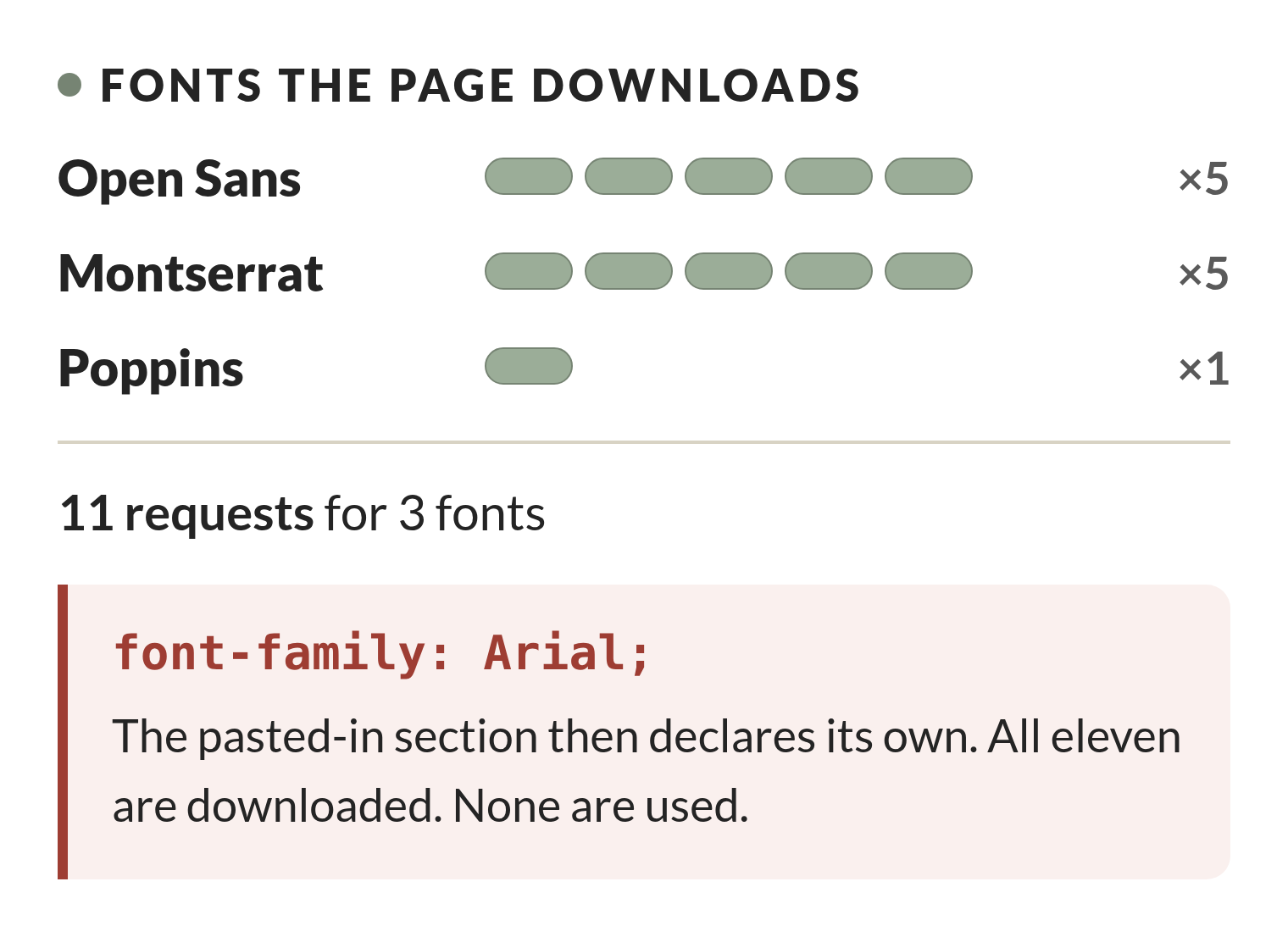
Nobody notices this. The page still works. But every one of those requests is a small delay before a visitor sees anything, and on a rural connection those add up into the gap between a page loading and a person deciding it isn't going to. You cannot catch this by looking at the page, on any device. You catch it by knowing that site builders do this and thinking to check.
Why this isn't just cosmetic
Everything above is fixable and mostly harmless. This part isn't.
Researchers at the ACM SIGACCESS accessibility conference tested whether generative AI can produce accessible websites on its own. Across six AI-generated sites, they catalogued 308 distinct accessibility errors — roughly half cognitive issues, half formal violations of the WCAG 2.2 standard. The most common categories were contrast problems, missing labels, and unclear page structure. Their conclusion was that these tools are useful for a first draft and that human review remains mandatory.
The missing-labels part is worth sitting with, because it's what those decorative symbols actually do. A sighted visitor sees a small picture above a heading and correctly ignores it. A screen reader has no way to know it's decorative unless the code says so — and AI-generated markup routinely doesn't. So instead of skipping it, the screen reader announces it. Your visitor hears "white square" before the name of the button they're trying to press.
For the Fairview Community Center, that's an older member trying to find event information on their phone and giving up. Or someone using a screen reader who can't work out what a button does. You don't see those visitors leave. You just quietly stop hearing from them.
Credit where it's due
I want to be fair here, because "AI writes bad code" isn't true and isn't the lesson.
That same page got real things right. The embedded video had a proper title on it. External links carried the right security attributes. Links opening in a new window said so, in text, underneath — which is a genuine accessibility courtesy that plenty of professionally built sites skip. The layout collapsed correctly on tablets and phones. I checked the text colors against the contrast standard and nearly all of them passed comfortably; only one fell short, and only barely.
That's the uncomfortable part. The code was mostly competent. What it lacked wasn't skill — it was any knowledge of the specific site it was being pasted into.
The trap nobody plans for
There's one more cost that shows up months later.
AI is very good at generating a page that displays this week's information. What it generates is a page where this week's information is typed directly into the code — the date in one place, the link to the flyer in another, the video in a third. Every week, someone has to open the code and change all three by hand, in exactly the right spots, without disturbing anything around them.
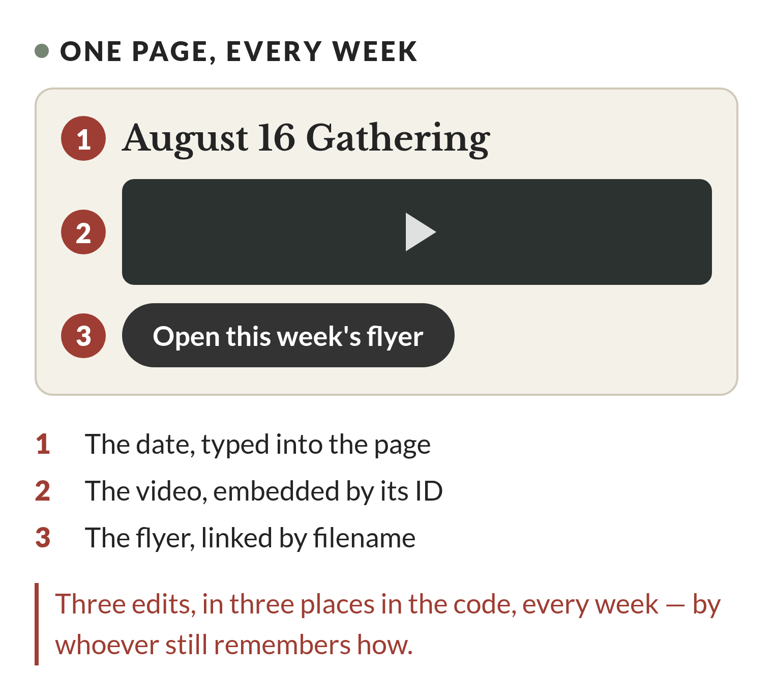
That works fine while the person who built it is around and remembers the routine. The failure mode is boring and predictable: they get busy, or move, or hand it off, and the page keeps confidently displaying information from three weeks ago. A page that's wrong is worse than a page that's plain, because a visitor has no reason to doubt it.
Someone who builds sites for a living asks "who updates this, and how often?" before writing a line, because the answer changes the entire approach. An AI tool doesn't ask, and there's no reason a volunteer would think to.
What AI is genuinely good at here
None of this means you shouldn't use it. It means being clear about which side of a line you're on.
It's genuinely good at drafting a first pass of your About page. At giving you six headline options when you're stuck on one. At telling you what sections a page like yours usually needs, which is real expertise and hard to get otherwise. All of that is helping you think, and it's good at it.
Where it gets risky is the jump from helping you think to generating the actual code that goes live. The gap between those two things is exactly the knowledge it doesn't have: what your theme already provides, how your builder's editor actually behaves, who maintains this in six months, and what "finished" looks like on a phone versus a laptop.
How to use it on your own site without getting burned
If you're going to do this yourself, treat what comes out as a rough draft rather than a finished piece.
Preview every change on an actual phone before you publish — not the desktop editor's phone preview, a real phone in your hand. Read through what it generated looking for stray symbols or empty boxes; that's the clearest sign something wasn't finished. Be wary of pasting in font or style code, since your builder is almost certainly loading its own already. Do one small section at a time rather than a whole page, so when something breaks you know exactly what caused it and can undo just that piece. And before you publish, ask yourself who changes this next month and whether they'll know how.
AI can absolutely help a small business move faster online. What it can't do is stand in for someone who understands how the pieces of your specific site fit together. If a change touches something visitors depend on — donation buttons, event schedules, contact information, anything tied to a busy season — it's worth having someone take fifteen minutes to look it over before it goes live. That's a much smaller cost than finding out after the fact that a quick fix quietly broke something nobody noticed for a month.
If you've already made a change like this and you're not sure what it did, that's a reasonable thing to have someone check. It's usually a short conversation, and it's a much better one to have before a busy season than during it.